Authentication: Rebuilding a signup flow that nobody owned
TLDR
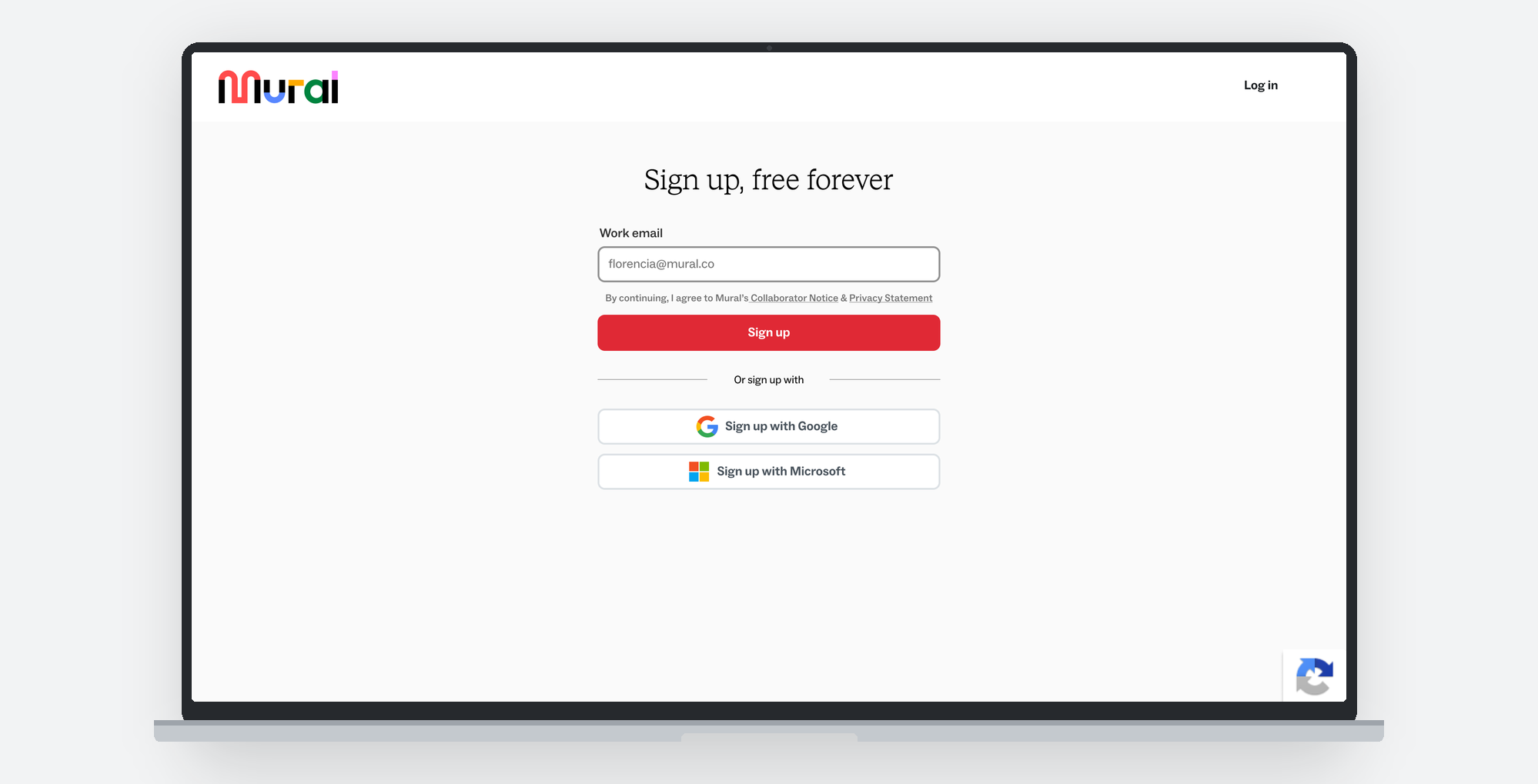
By late 2024 acquisition was falling, and only 52.8% of the people who reached Mural’s signup page finished creating an account. The flow had no owner. Teams had been adding to it for years, none of it was documented, and any redesign risked breaking paths nobody remembered were there. Mapping it was weeks of work nobody would approve while conversion fell, so I put the engineering fixes first and used the six weeks they ran to do it. What came out of that map was not a visual problem. It was deciding what belongs in the flow, what leaves, and where the rest sits.
Shipped as a 50/50 test: conversion up 10.8%, and abandonment on the profiling questions down 33% while the number of questions doubled.
Context and problem
Most growth work is about attracting people. Everyone in this funnel had already decided to try Mural, and half were failing to finish.
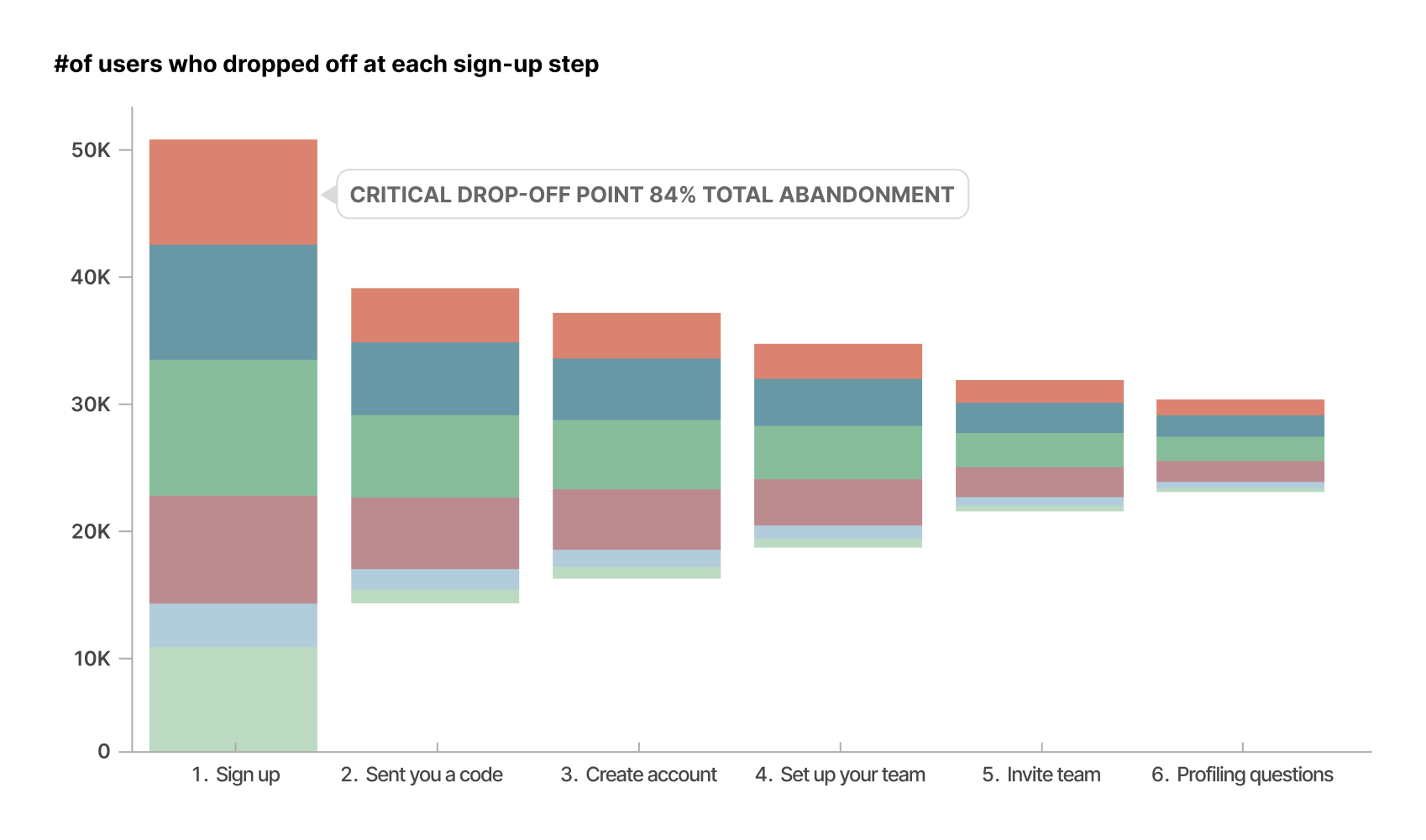
The flow had been built by teams passing through. Marketing needed first-party data, so two profiling questions went into the middle of the flow. Another team needed a way for new users to join existing workspaces and shipped it untested. Nothing was accessible, which put customer contracts at risk, and none of it worked on a phone. Mural’s design system, mature by then, had never been applied here.
None of this was hidden. CSMs had filed the missing SSO as a product gap. Support logged around 40 tickets a month from users confused by “Sign-in” against “Login.” The problems were known and undisputed. Reconciling them was nobody’s job, and the flow had never been documented: no diagram, no list of paths, no record of which edge cases had been handled.
Key decisions
A phased strategy, so the discovery was already paid for. The whole flow had to be visible before any of it could be designed, and nobody grants that time while the funnel leaks. So instead of one redesign I proposed three phases. One, stabilize: bugs, dead ends, the missing SSO paths, the outdated bot challenge. Nobody argues about fixing broken things, so it was approved immediately. Two, rebuild: the design system applied properly for the first time, accessibility, responsive, one set of interaction patterns across every screen. Three, brand: the personality the flow had never had. Phase one ran six weeks and was almost entirely engineering work, which is the time I spent mapping every path we had. The delivery plan was the research plan.
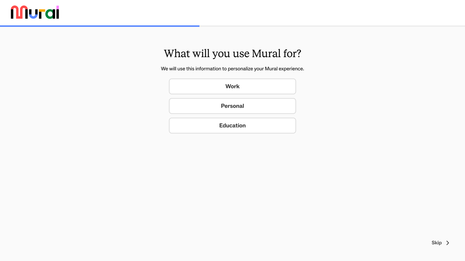
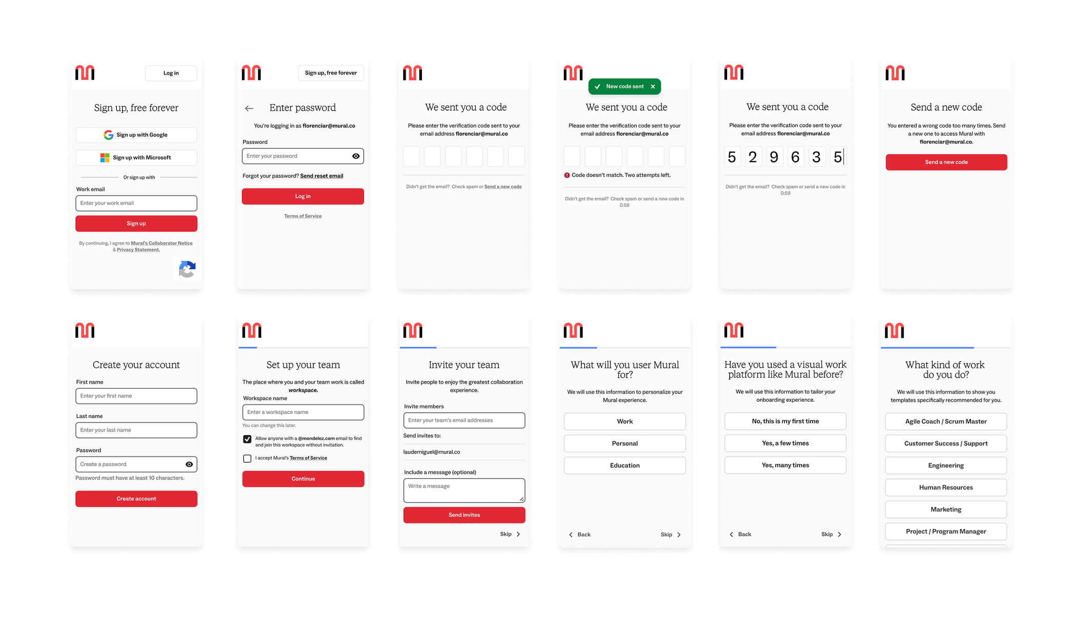
Ask twice as much, and move all of it out of the flow. Marketing had placed two profiling questions in the middle of the signup flow, straight after account creation, to capture first-party data, and a significant share of people dropped out there. The design team wanted the questions gone. Both sides were arguing about how many to ask. I met them in the middle on a different axis: four questions instead of two, moved to the end, after the team was invited and just before the person landed on the canvas. An ask in the middle of setup competes with finishing setup. An ask once everything is created does not. We doubled the data captured and abandonment on the questions fell by a third.
- Sign up
- Code
- Create account
- 2 questions
- Set up team
- Invite team
- In Mural
- Work email
- Code
- Create account
- Set up workspace
- Invite team
- 4 questions
- In Mural
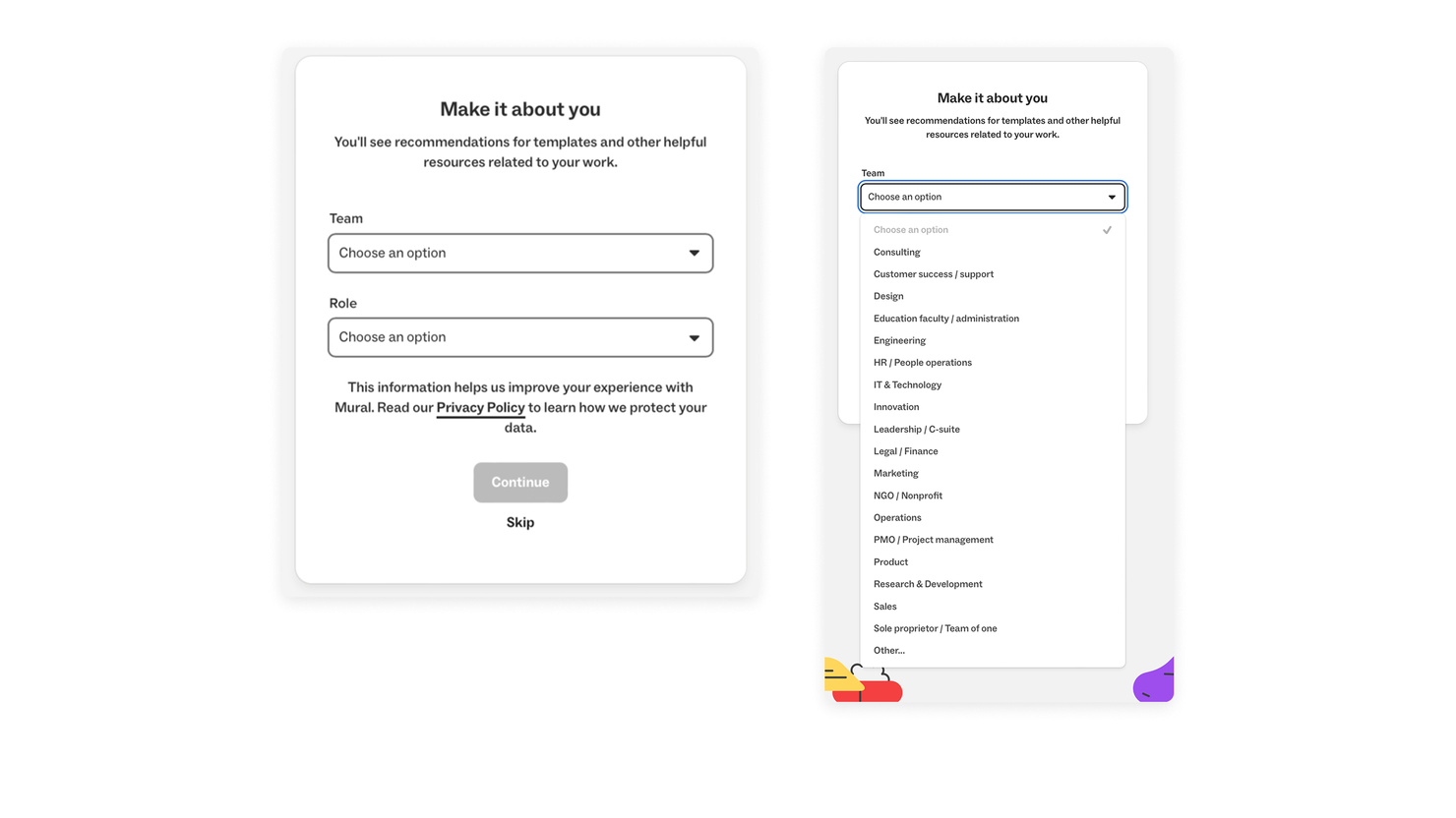
Compliance copy above the button, without losing the button. Mid-redesign, legal required the terms and privacy policy to appear before the primary call to action, because companies were being fined for placing them after it. The requirement was about placement, not prominence, which left the real question open: how does dense legal copy sit above the button on the screen already carrying most of the drop-off, without becoming the thing the eye lands on.
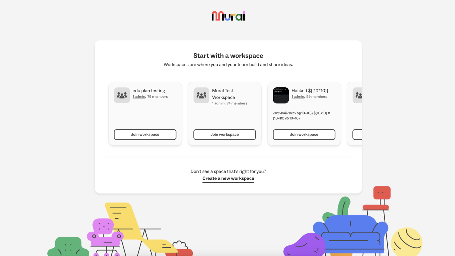
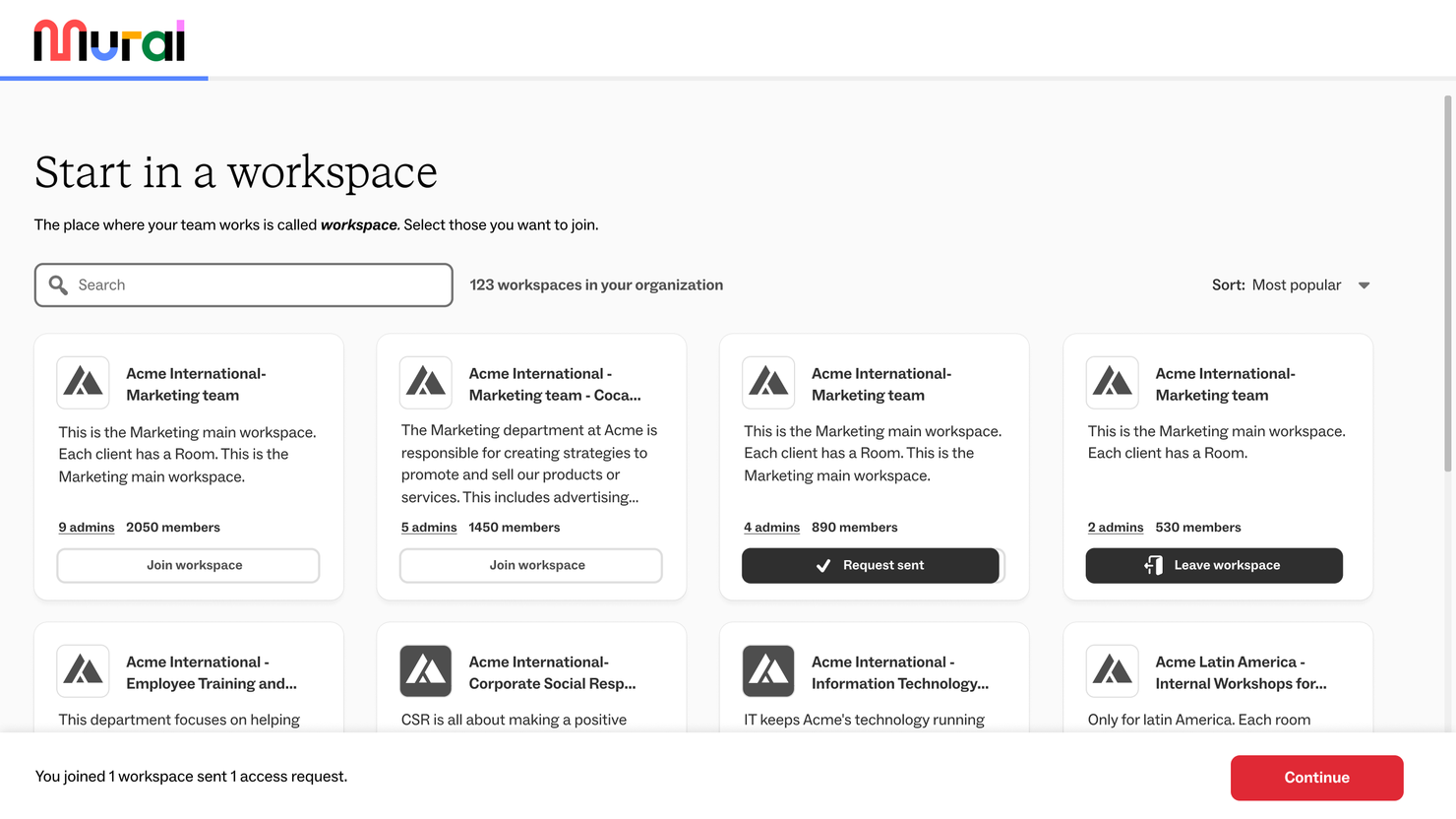
Workspace join, and the version I threw away. Our first version passed internal testing. It also assumed a person joins one workspace and knows its name. In a company with hundreds of workspaces on a naming convention, neither holds. Search is not a refinement of that screen, it is the screen.
Outcome
We shipped to 50% of traffic for a month, then to 100%. Assignment was random and both groups lived through the same month, so anything else moving the funnel moved it for both.
| Before | After | Change | |
|---|---|---|---|
| Signup conversion | 52.8% | 58.5% | +10.8% |
| Profiling abandon rate | 4.5% | 3% | −33% |
| Profiling skip rate | 33% | 27% | −18% |
| Profiling completion | 63% | 70% | +11% |
We did not isolate individual changes: the conversion number is the flow as a whole, and the profiling rows measure one decision.
The questions also returned something nobody had asked for. What new users told us about themselves cut against assumptions the product had been designed on, and those learnings went on to inform other teams’ initiatives, onboarding first.
What I would do differently
Get qualitative signal earlier. Funnel data told us where people left, never why. Our internal test participants already knew the workspace they were looking for, so the version we built assumed everyone did. A month of the wrong participants cost more than a week of the right ones.
Not save the brand work for last. Phase three was the only phase about personality rather than repair, and it never shipped: once conversion recovered, the argument for it got harder. A phase funded by urgency loses its slot the moment the urgency ends.