Hana: Redesigning a ten-year-old canvas without breaking millions of existing murals
TLDR
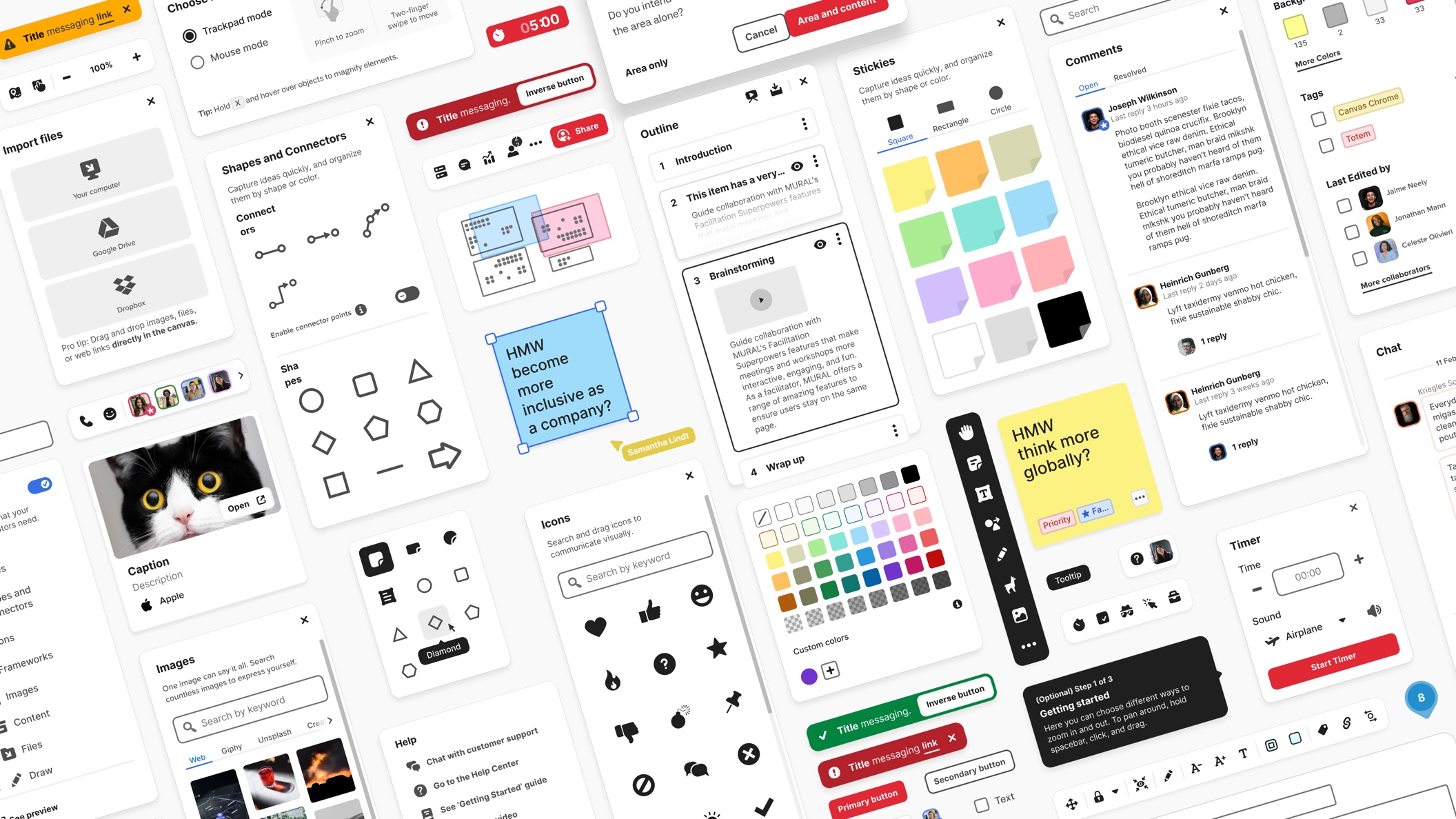
Mural’s canvas UI was more than ten years old, and an outdated look and feel was the most frequent complaint in NPS detractor comments. Modernizing it meant larger sizes, more padding and taller line height, which would have broken the layout of every board anyone had built in the previous decade. I led the redesign across the application chrome and the canvas content, and the way out was four coexisting themes instead of two, so a ten-year-old canvas could change its look without changing anyone’s layout.
Context and problem
The redesign had two halves, and they behaved nothing alike. Hana is the name of the redesign and the name of the new UI. Classic is the old UI.
The chrome UI consisted of menus, panels, toolbars, sidebars, and the full icon system: a complete system redesign, but self-contained, because nothing a user had made depended on it. I owned it end to end, and I used the rebuild to ship more than a new look. Type sizes and contrast were reworked for accessibility, targets enlarged, corners softened, every icon redrawn, and I folded in information architecture changes the team had been holding for exactly this kind of opportunity.
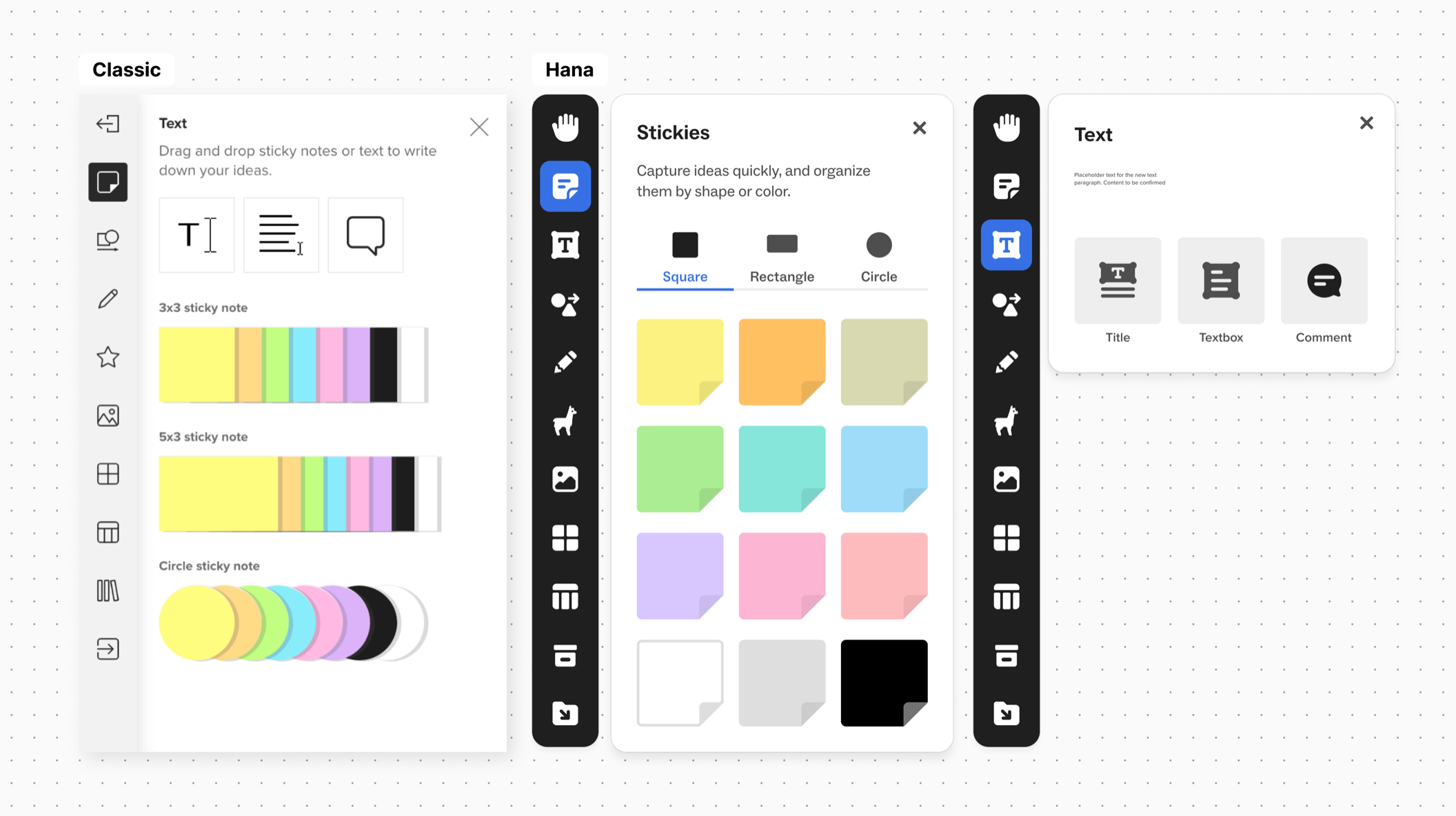
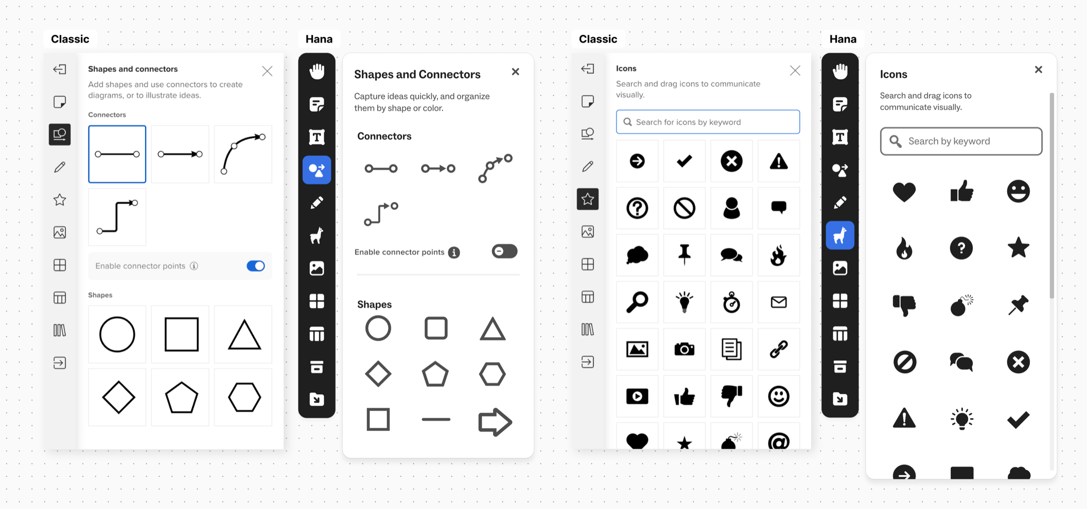
The panels below carry the change. The visual thinking toolbar goes dark and the selected tool takes a filled state rather than a grey one, panels widen, type grows, and the swatch strip becomes a grid where every colour is a note whose shape you can read. Across all four, the cell disappears: Classic gave every shape, connector and icon its own bordered box, so a panel read as a grid of containers, and Hana lets the objects sit on open ground and uses space to group them instead. Same content, roughly the same panel width.
The canvas
Changing the UI of the dynamic elements on the canvas was different. A mural is not a document that reflows. It is a fixed arrangement of objects in space, and the arrangement is the work: a facilitator places stickies into a framework, aligns columns, sizes a diagram to fit a section. Grow a sticky and it no longer fits where its author put it. Apply new sizing to ten years of existing murals and every one of those arrangements breaks at once, with no undo, from an update the user never asked for.
Migrating each mural to the new UI automatically was not an option either. Re-measuring every widget when a mural opens was too slow on boards with thousands of objects.
So the same values could not serve both. New murals needed the larger sizing for the redesign to be worth doing; old murals needed the original sizing, because changing it would have meant thousands of users rebuilding work they had already finished. On top of that, users had to be able to try the new look, go back, and copy content between old and new murals without the styling breaking.
The way out was to stop treating the redesign as one thing. Until then, visual style and sizing had been treated as one inherent change. They did not need to be. Through deep collaboration with engineering we pulled the two apart, which took us from two themes, Classic and Hana, to four: the two the user knows, plus a Lite of each that carries one half of the change and leaves the other alone. This way, the user could:
- Continue ongoing work in the Classic style in their murals.
- Try the new UI on their old murals without breaking the layout, and switch back to the older look.
- Create new murals in the Hana style and turn them into the Classic visual.
- Copy and paste content between old and new murals and have the styling hold.
All of this happens in the background. The user thinks they are experiencing two themes: Classic, and Hana. The success of the whole release relied on that assumption holding.
You can try the differences between the four themes yourself here:
An existing mural
A new mural
Side by side, that difference is almost nothing. It is why four coexisting themes never made the product look like four products.
Sticky notes are by far the most used object on a Mural canvas, so a value that is slightly wrong for a sticky is wrong on nearly every board in the product.
And a sticky is not one number. Its text autofits, so the box, the padding, the type size, the line height and the alignment all move together, and changing any one of them changes how much a person can write before the note stops holding it. I specified each value for every note shape under all four themes. Below is a simulator of that specification: pick a theme and the notes render from its own values at actual size, so the numbers and the notes cannot drift apart. Teal marks the values that move with sizing rather than with visual style, padding among them, specified as a share of the note’s height rather than a fixed number.
This is a sticky note
This is a sticky note
This is a sticky note
The handoff worked better this sprint, but we still lost a day waiting on final copy. Worth agreeing a cutoff with marketing before the next one so the build is not blocked at the end.
Shown at actual size · square and rectangle defaults
Visual style
- Shadow
- Yes
- Rounded corners
- Yes
- Palette
- Hana palette
Sizing and layout
- Square
- 168 × 168
- Rectangle
- 288 × 168
- Circle
- 168 diameter
- Padding, square
- 8% of height 13.4px
- Padding, circle
- 20% of height 33.6px
- Default font size
- 28px
- Line height
- × 1.03 28.8px
- Alignment
- left / top
Key decisions
A release paced by the user, not by us. Mural is used live: a facilitator prepares a workshop for weeks, and if the tool changes the morning they run it, they are relearning the interface in front of a client. So I designed adoption to be theirs to time. The chrome shipped as a toggle anyone could flip, with a deadline after which everyone moved. The canvas could not work that way, because a mural is something the user made, so every path through the migration flow preserves their work, and no conversion is a one-way door.
Reverting is not symmetrical. This was the call I had to defend. A user can always get the old look back; they cannot always get the old sizing back. The objection was that this is inconsistent, and it is. The answer is that the two losses are not the same size: losing the visual change is an aesthetic disappointment, and losing the layout is losing work. Consistency would have cost the thing the whole release was built to protect.
Reflection
The whole release rested on one assumption: that the average user would not perceive the size differences. It held.
Legacy is a design material. Ten years of existing murals wasn’t an obstacle to the redesign; it was the thing being designed for. Most modernization work fails by treating the past as a problem to route around.