Home Pausa: Building the feedback loop journaling never had

Pausa: Building the feedback loop journaling never had

Role: Co-founder, product and design lead

Timeline: 2024 to 2025, live on iOS since December 2024

Contribution: Product strategy, brand and identity, design system, interaction design, prompt design, onboarding

Pausa is an AI journaling app for iOS. You write by voice, text, WhatsApp or email, and every week it reads across your entries and returns your themes, your mood shifts and a few things to act on. It exists because everyone knows journaling is good for them and almost nobody keeps it up: it takes too long, it happens alone, and nothing ever comes back.

I co-founded it and ran product and design end to end as the only designer: strategy and roadmap, brand and identity, a design system built from scratch, every screen and interaction, the prompts that write the recaps, the onboarding and the subscription model.

Live on the App Store since December 2024: 6,200 installs, around 400 people writing every week, around 150 paying subscribers, and one in four weekly writers opening it every day.
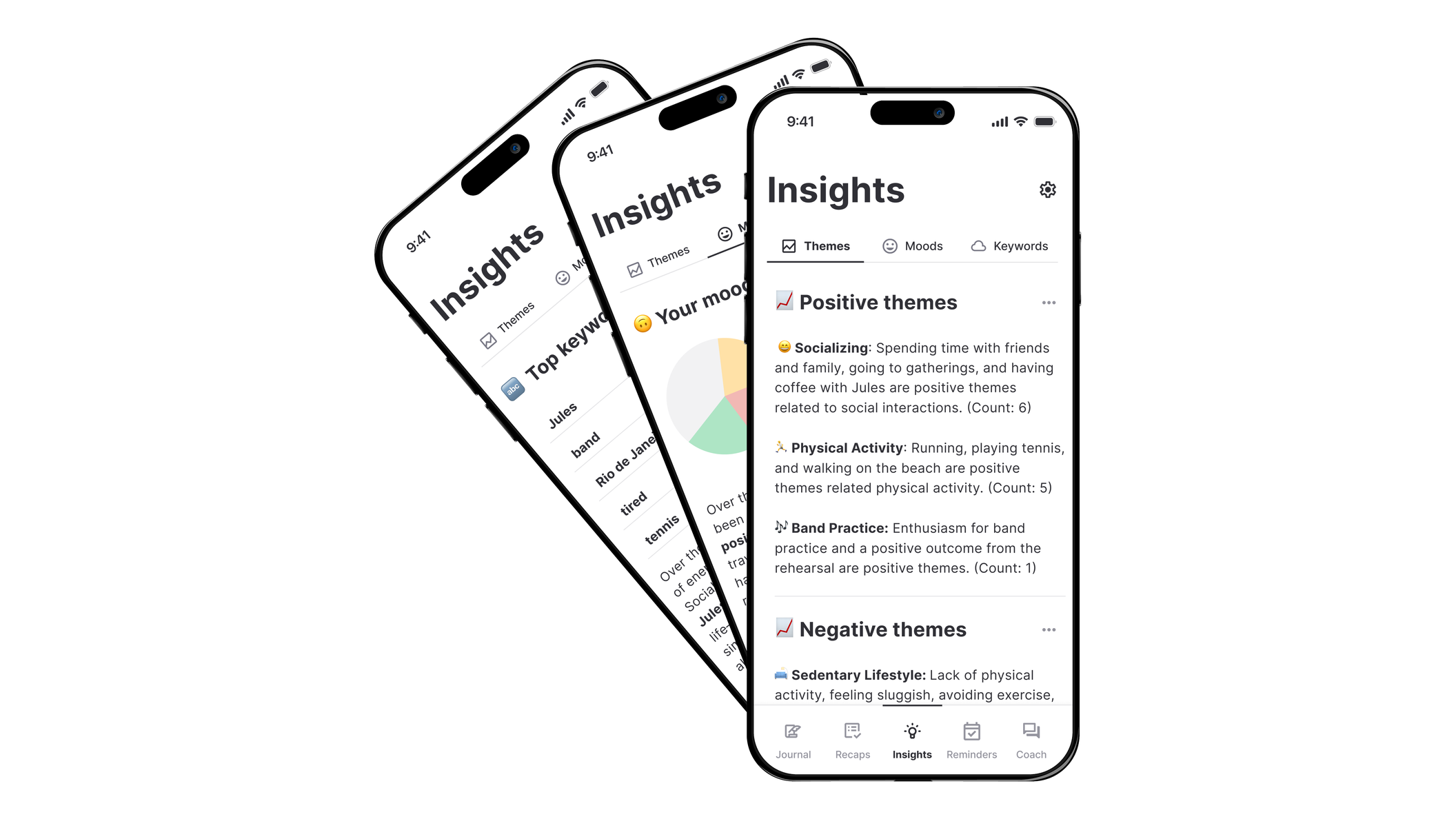
Three phones fanned out, all showing the Insights tab: themes, moods
              and keywords read out of a person’s own entries, with the
              front phone listing positive themes such as socializing and
              physical activity, each with a count.
Insights: what the app finds in your own writing. The themes you keep returning to, how your mood moved, and the words you use most, each read straight out of your entries rather than asked for in a form.
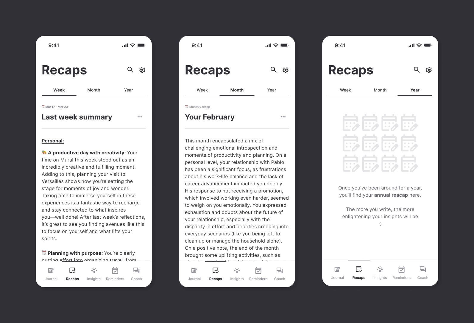
Three recap views: last week’s summary written out in themed
              paragraphs, a month recap, and the year view holding an empty
              state that explains what will appear once there is a year of
              entries to read.
Week, month and year, all written out of your own entries, and every recap ending in action items. A pattern you cannot act on is a horoscope.
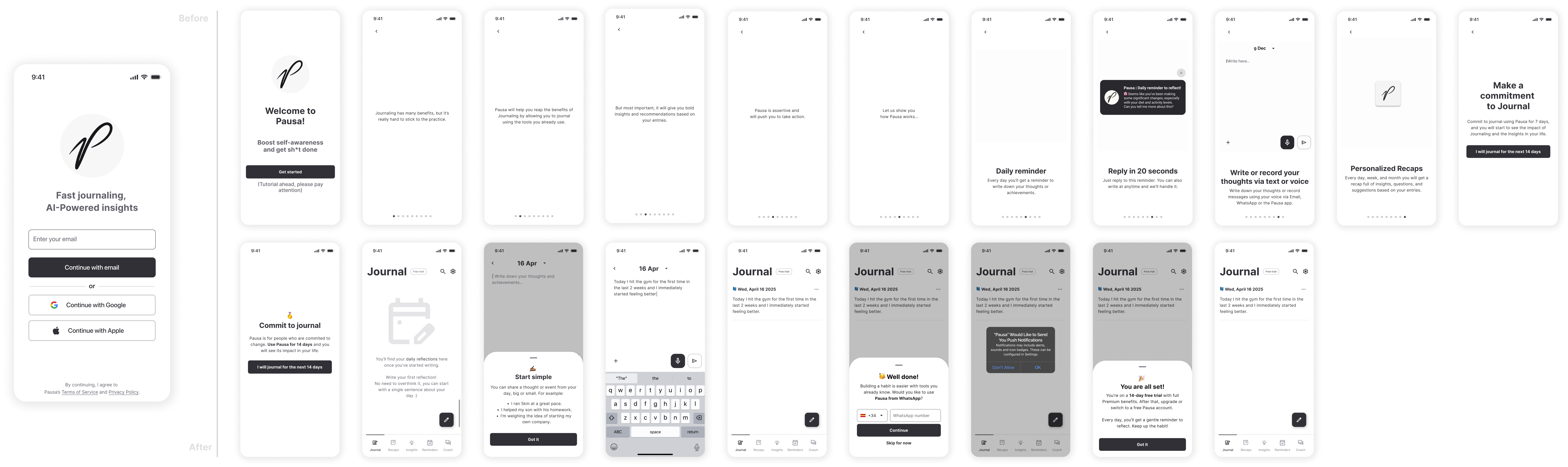
Two onboarding flows compared at the same scale. Above, twelve
              near-empty screens explaining the product one benefit at a time.
              Below, a shorter path that opens the journal, prompts a first
              entry, then asks for WhatsApp, notifications and the trial.
Before on top, after below. The screen count barely moved; what moved is where the writing starts, on screen four instead of after twelve screens explaining the product. Conversion through onboarding went to 70%.
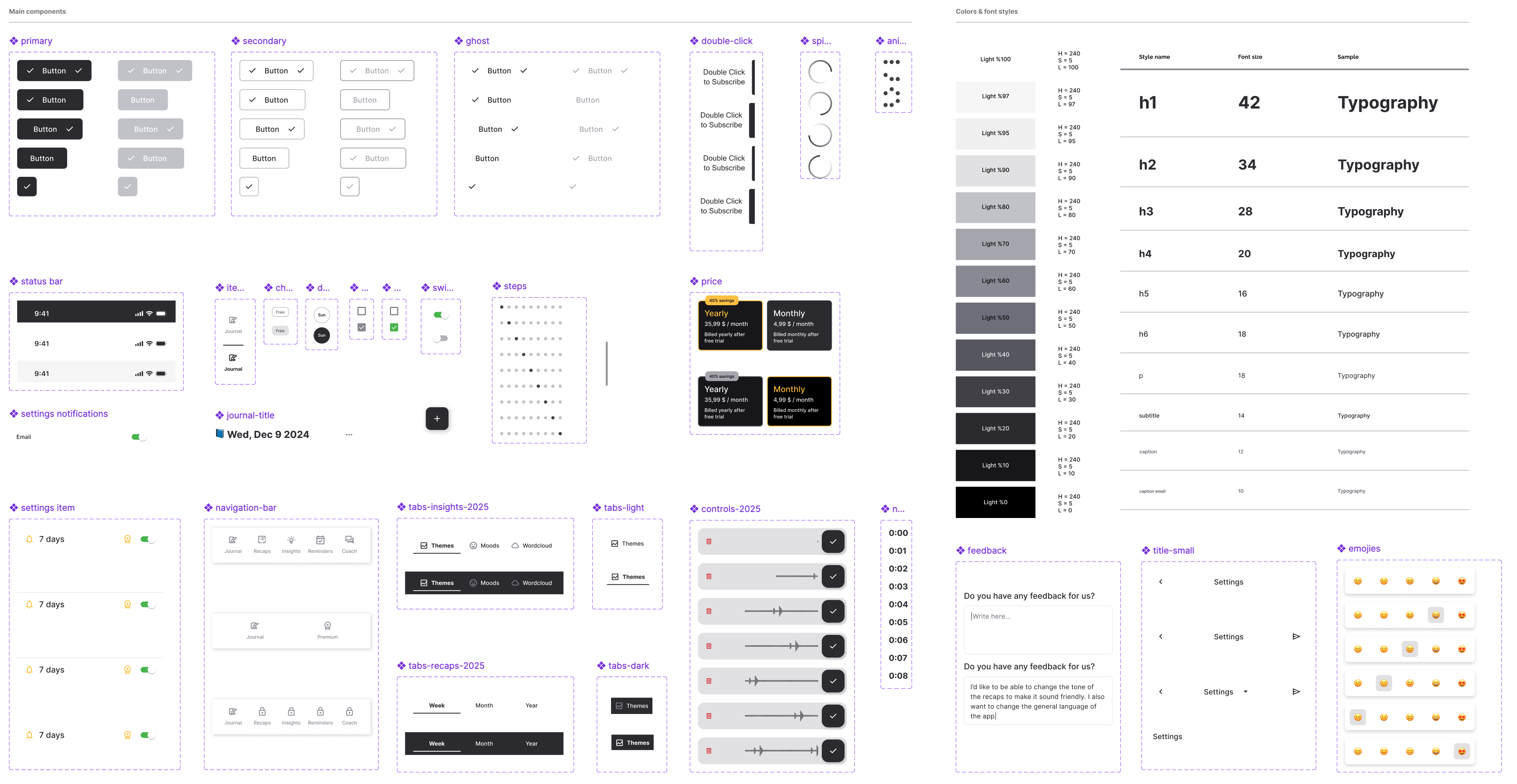
The component library: primary, secondary and ghost buttons in every
              state, the status bar, tab bars, sliders, settings rows, the price
              cards, the feedback sheet, and beside them the grey ramp and the
              type scale from 42px down to caption.
One typeface at two weights, nine values of grey, three status colours, a seven-step spacing scale. Small on purpose, and small because it was made for this and nothing else: an adapted system would have arrived carrying components a journal has no use for.

Reflections

The riskiest idea should be the cheapest thing you test. For the first months Pausa was an email address: a reminder went out, you replied with whatever you had, and a recap came back on Sunday. No app, no interface, nothing to install. It answered the only question that mattered, whether a summary of your own week is worth reading, and it answered one we had not asked. People wrote back asking for WhatsApp and voice, because they did not want another place to go. Voice became the most used way in.

Prompt work is interaction design. The quality of a recap is a prompt, not a screen, and it took as long to get right as the interface did. Tone, length, how directly it addresses you, whether it flatters you or tells you what it can see. A recap that reads like a compliment is worse than one that reads like a friend who was paying attention.

Ask after the value, not in front of it. The core of Pausa is the weekly recap, so nobody can know what they would be paying for until a week has passed. The trial runs full Premium for fourteen days and the ask arrives after two recaps have landed. It was the hardest call to argue for, because it gives the whole product away to people who may never pay for it.