2020 / 2021
Diagramming
experience in Mural
Improve user experience when creating diagrams using Mural.
About Mural
I joined Mural in 2019, when the company had less than eighty employees and, since then, the company has grown to six hundred people. This project was developed in 2022, with me working as a Lead Product Designer in the Canvas Core team, which is responsible for all main interactions in the canvas.
How we work
As a Lead Designer, I’m responsible for leading UX & UI decisions across the Visual Thinking pillar, where my team belongs to. I use Design Thinking as a framework for my design process, keeping the user always in the center but considering business needs and technical capacities.
Role in this project
Sr. Product Designer (2020 - 2021). Interaction design, Visual design, Prototyping, Testing, Information Architecture, implementation follow up, Design QA
Overview of the project
The goal of this project was to improve users’ experience when creating diagrams in the canvas and to fill the gaps we had when being compared with other products.
Background
When pandemic started in 2020, and everybody had to go 100% remote, a great number of clients who were not used to creating diagrams collaboratively and from home, had to start doing it. Back in those days, Mural was lacking some basic features and diagram creation was slow, inefficient and cumbersome. Some quotes we gathered:


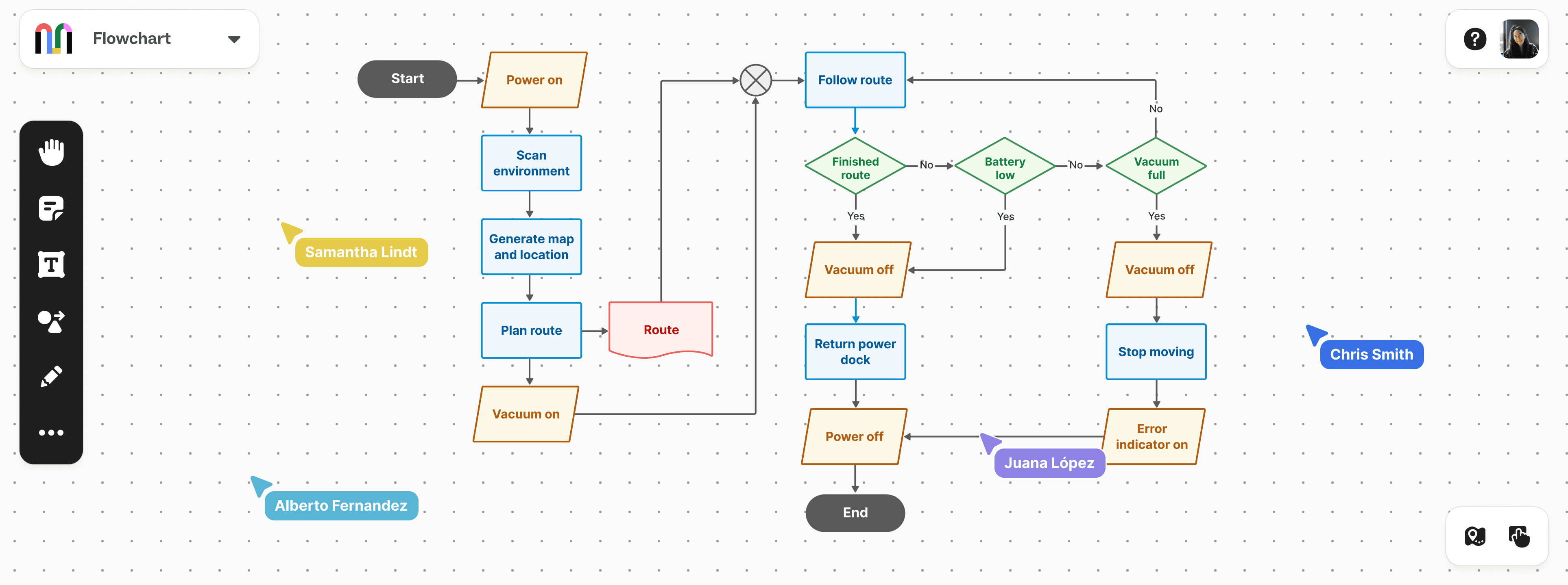
Diagrams creation was a must-have for Mural, so we decided to redesign the entire diagramming experience. We started doing a lot of user interviews and we identified nine main use cases that could be interpreted as diagramming: simple ideas' connection, flowchart creation, mind maps, org charts, UML diagrams, network diagrams, site maps, timelines and free diagramming.

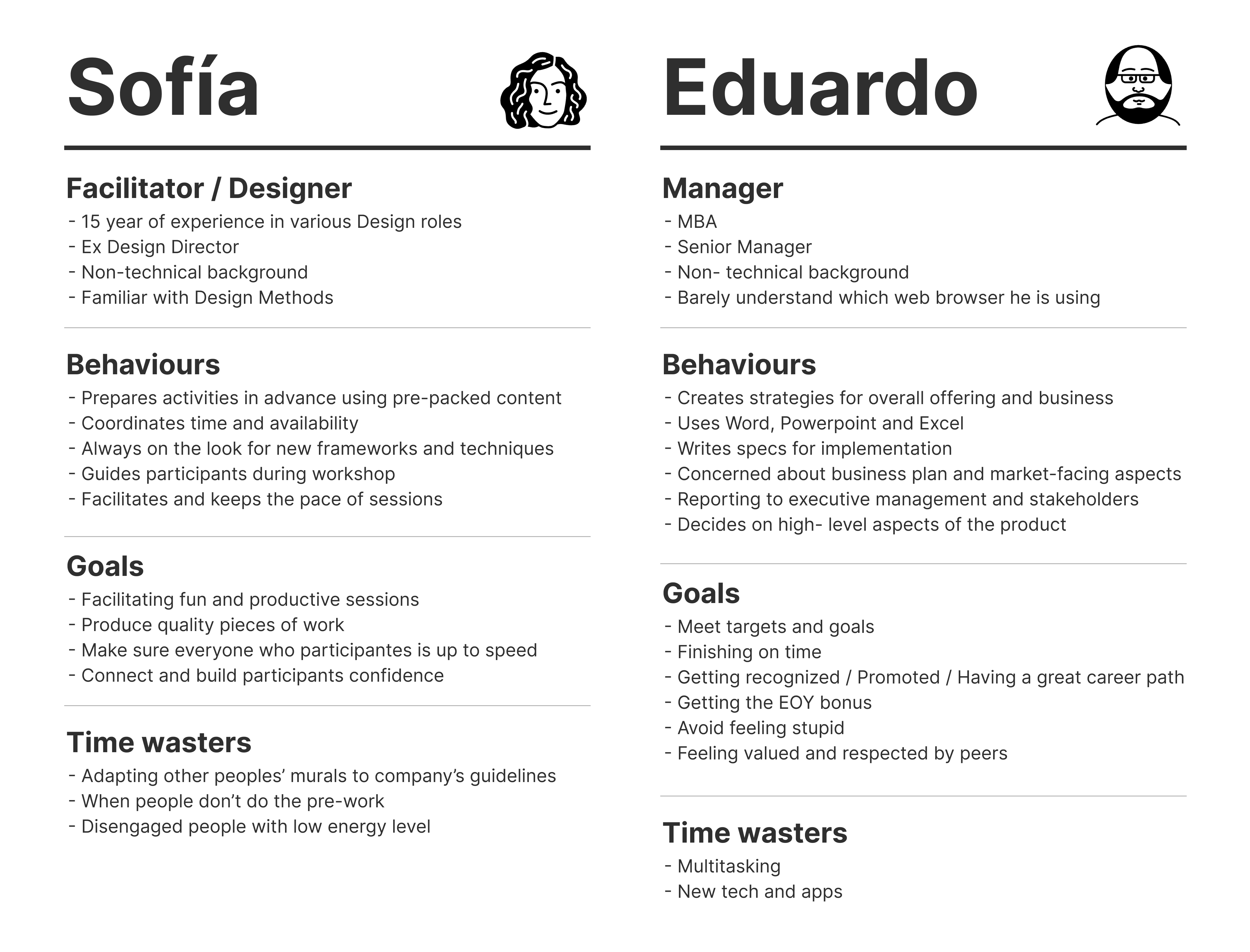
Our main User Persona was Eduardo, a rookie Mural user whose goal was to seem smart in front of their colleges. We also worked with secondary user persona in mind, called Sofía: a designer always interested in learning how to do things perfectly and the-right-way.
Then, we made Benchmark analysis, in order to understand where we were standing in comparison with the rest of the market. We run tests for each use case in several tools we considered competition. Among them, we can mention:

We built a Story map for each of those cases, aiming to understand the amount of work involved in each of them.

We also prioritized the use cases. For that, we used an Impact/difficulty matrix (LUMA Method) taking into account the amount of users trying to accomplish each of them, how expensive (in terms of time and resources) they were and, of course, how each of them fit the whole product strategy.

Once we had all our priorities clear, we made users interviews to gather specific feedback and analyzed the users’ journey when trying to accomplish the goals associated with each use case. This helped us understand better the pain points and unmet needs.
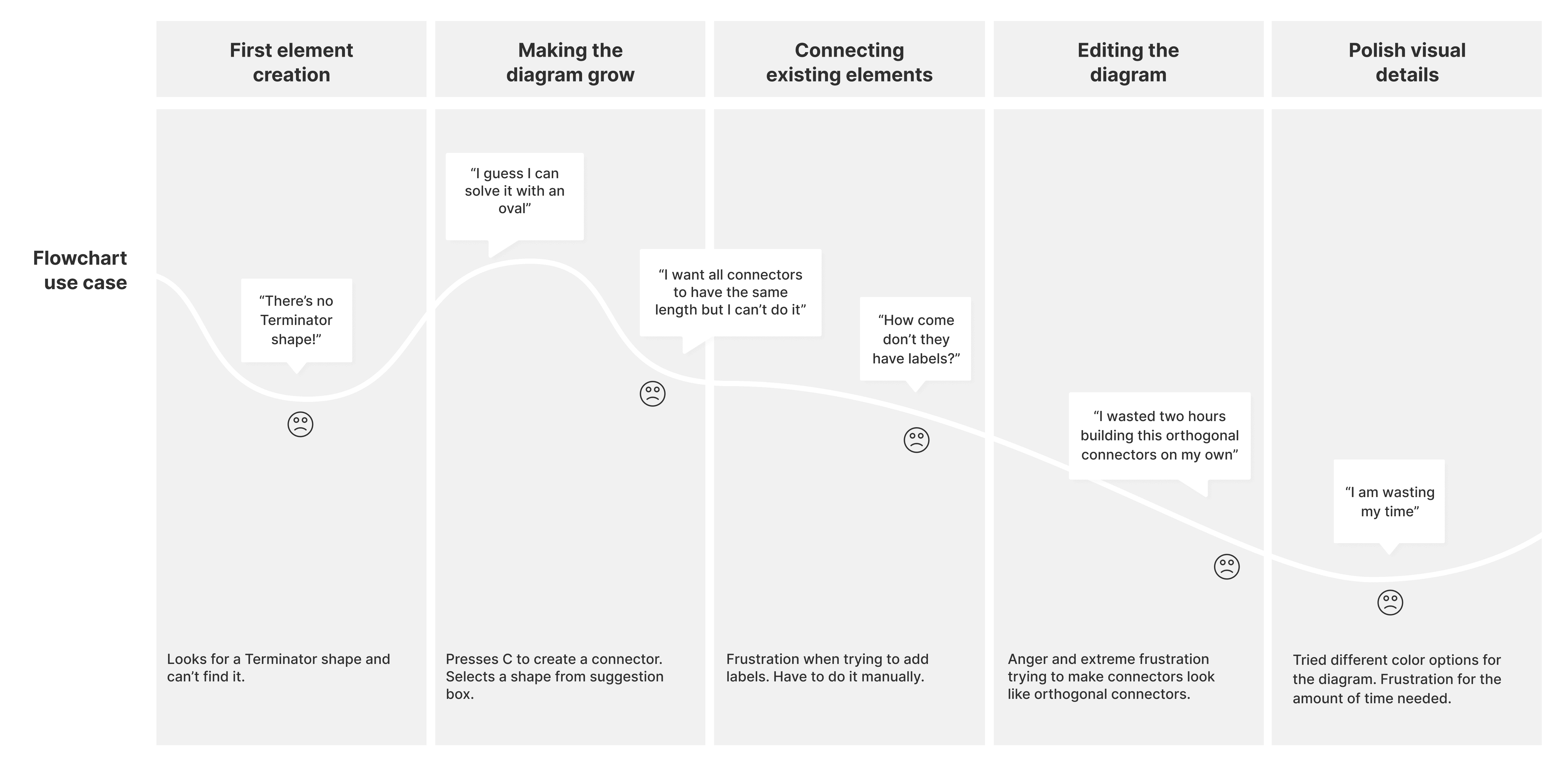
In addition to having identified particular needs for each of the identified use cases, we also got some useful general key learnings.
The main users’ pain points were:
Speed. No way to create a diagram fast, essential for situations where users needed to create a quick diagram on the go.
Lack of basic functionality, considered fundamental by users: for instance, orthogonal connectors
Unexpected connectors’ behaviors caused by bugs, which was causing lack of reliability.
So, at this point, it was clear that we needed to:
Design a solution for increasing users speed when creating diagrams.
Design new orthogonal connectors functionality to the canvas since they came up as essential for supporting almost all use cases.
Revisit all connectors behavior and take over the engineering debt that was causing the bugs.
We decided to tackle these three items as three parallel, but connected, tracks.
SOLUTION 1
Increase users speed
We started a second research with the goal of understanding which of the competitors were successfully supporting the use cases we also wanted to support. We needed to understand how they were doing it, so we could take advantage of their learnings and incorporate that into our product instead of reinventing the wheel. With those goals in mind, we run several usability tests in competitors' tools and cross teams divergency sessions (Brainstormings and Crazy eights) with engineering, product managers and designers.
Finally, we decided to incorporate a new way of creating connections between elements.
Until then, there were three ways of creating connectors in Mural:


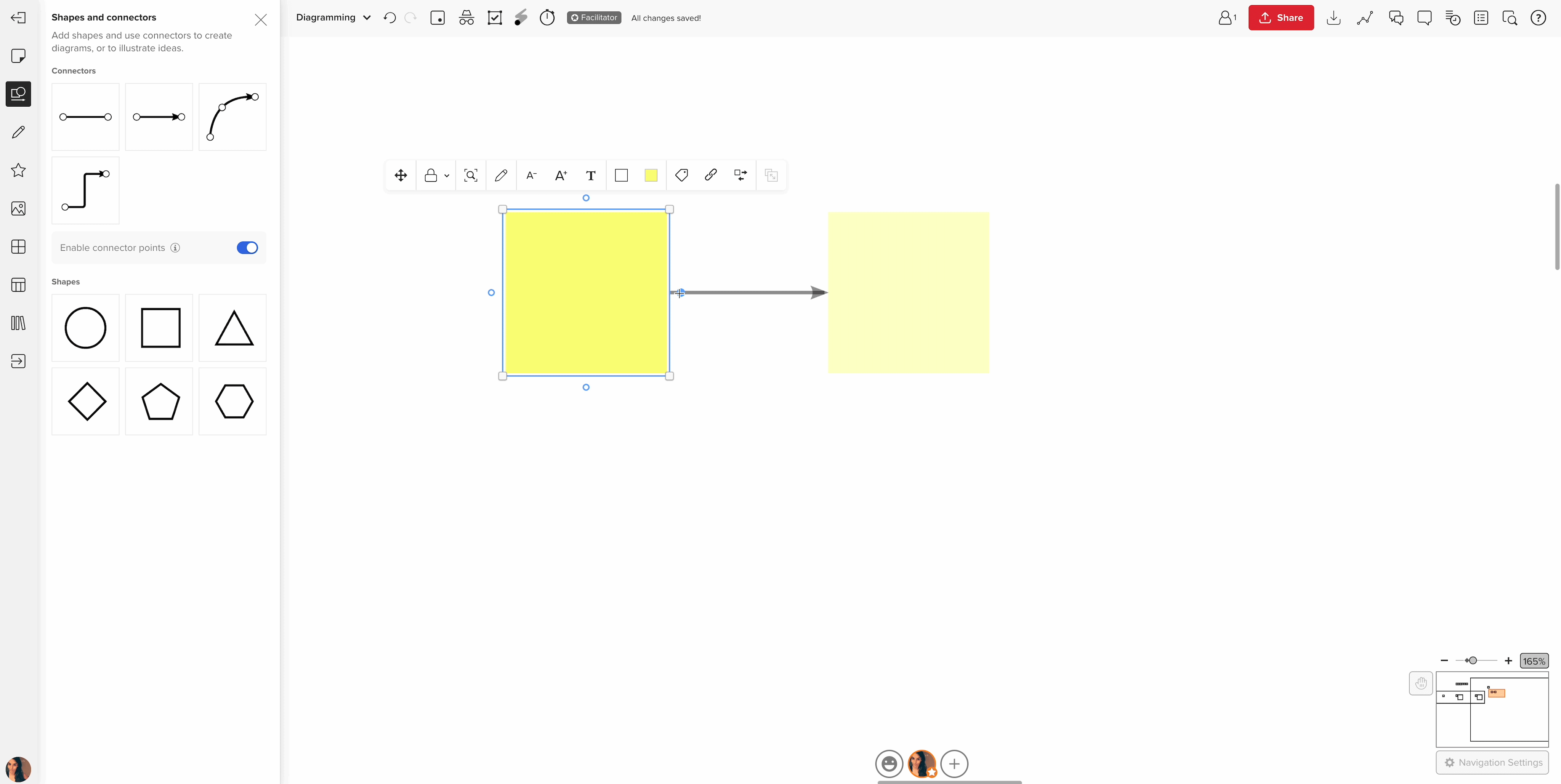
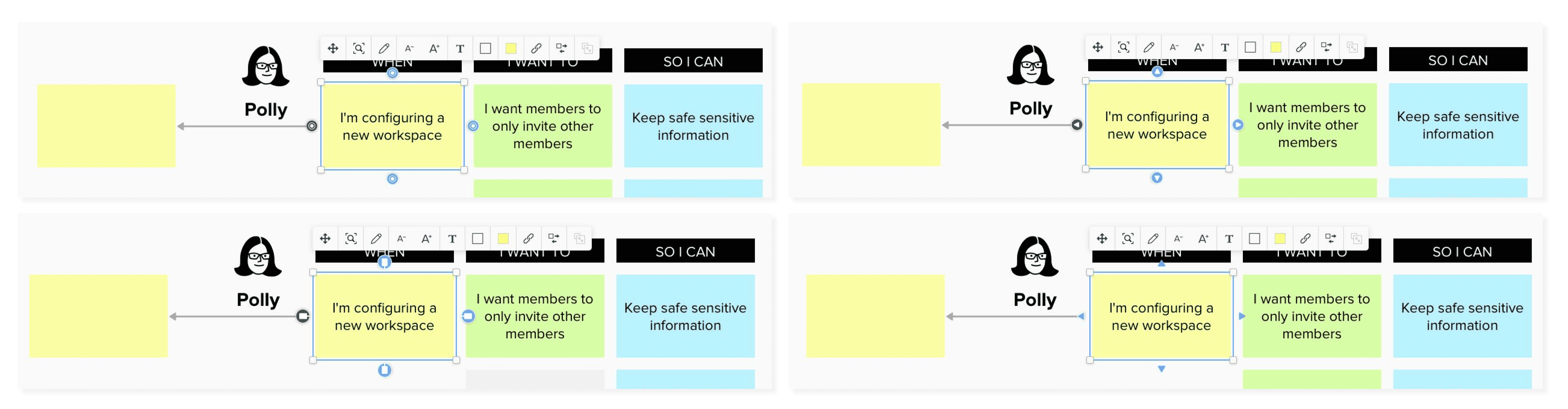
We decided to add what we called “connector points” to the canvas elements. So, when the user selects an element that can be connected, four small dots appear, at each side of its bounding box. Those connector points can be turned on/off from the connector's sidebar.
Different behaviors can be triggered from them, depending of the user behavior:
_
Case 1
If the user hovers the connector point, three different things can happen:
a. While hovering, if the element doesn’t have any other element nearby, a low-opacity new element that looks identical to the original one will appear, connected to it. If the user stops hovering, that low opacity element will disappear.

b. But if the user clicks on the connector point, that new element and the connector will be created on the canvas.
c. If there’s another element nearby, while hovering the connector point, some connections between them will be suggested. If the user makes a single click, that connection will be created.

_
Case 2
If the user clicks and drags from any of the connector points, they can:
a. mouse up on another element and connect them


b. mouse up on the canvas, which will trigger a popup suggesting new elements. The user can choose any of those to make the flowchart grow
Needless to say that we had to go several times over the cycle of prototyping-testing before reaching the final stage that reached production. But the final result was stunning. By combining these behaviors, the users were now able to create flowcharts and diagrams faster and smoothly. Here you can see some of the UI discarded options for handles:
SOLUTION 2
New orthogonal connectors functionality
The first step was to run usability tests of each of the use cases we had identified, in competitors apps, in order to identify the strengths and weaknesses of each solution, for each one of those cases. After the tests, we reached the conclusion that any of the available apps had orthogonal connectors whose behavior was optimal for all the use cases we wanted to support, at the same time. So we needed to develop an original solution, a new connectors’ rearrange algorithm from scratch.
With that in mind, I started writing extremely complex behavior specifications and spent one full sprint doing that. But we realized that there were so many tensions we needed to balance and to take into account that it just wasn’t impossible to include and consider all possible situations. We needed a simpler way to design + validate.
So we had to come up with more general behavior principles instead of trying to tackle every single situation. Engineers created a Proof of concept (POC) where we started adding small behavior definitions, one by one, and testing all use cases every time we added something new. The POC started growing and after some iteration sprints, tons of internal and external usability tests, we reached a point where the connector's behavior was good enough for supporting all use cases we needed. Engineers started developing real code, using that POC as design specification. The POC became part of the design documentation.
Final behaviour:

Final visual results:
SOLUTION 3
Adress usability and tech debt
We also had to revisit the connection behavior of connectors:
- When is a connector connected?
- How does the user know when an element is connected?
- How “strong” should that connection be?
We run usability test of all the use cases we wanted to support, in Mural. That way we could identify problematic situations, bugs and contradictory and counterintuitive behaviors. The bugs were the easiest part to fix: We prioritized them in a difficulty/impact matrix with the Project Manager and the engineering team and we just fixed them.
But the real challenge was how to design a behavior pack of rules that works for all the use cases we needed, at the same time. How may we support a wide variety of use cases when an interaction rule that works for one, doesn’t for the others?
The answer was: priorities. Priorities should be clear, all the time. We decided to prioritize flowchart case over all the rest, and simplicity over precision, because our most important user Persona for this project was Eduardo, and he is a rookie.
How did we measure success?
Lorem ipsum. Lorem ipsum. Lorem ipsum. Lorem ipsum. Lorem ipsum. Lorem ipsum. Lorem ipsum. Lorem ipsum. Lorem ipsum. Lorem ipsum. Lorem ipsum. Lorem ipsum. Lorem ipsum. Lorem ipsum. Lorem ipsum. Lorem ipsum. Lorem ipsum. Lorem ipsum. Lorem ipsum. Lorem ipsum.
Learnings:
One of the key learnings we took from this project was that for complex interaction designs, building a POC with the developer can be faster than writing down a huge amount of behavior specs in a design document. Collaboration with the engineers and quick iteration cycles are essential to move forward.
Also, after a couple of months we realized that even if users were able to build different types of diagrams with the same elements (connectors, shapes and sticky notes), the level of success of the user experience was really different depending on the type of diagram the user was trying to create. Flowcharts, our most important use case, were really easily made unlike mind maps. Users were still struggling to create mind maps with the same elements they were creating flowcharts. So we realized that you can't ask for a widget to perform an infinite amount of jobs, specially if it needs to behave differently according to the users' goal.
That's when we started working on a new widget, specially designed for Mind maps creation.
Once all this was in production, we kept making improvements to the Diagramming experience, by adding some features we had considered nice-to-have in the beginning of the design process, such as labels, filtering and the addition of new shapes.