
2022
Hana.
Mural's UI redesign
Redesign of Mural's UI and all the widgets look and feel.
About Mural
I joined Mural in 2019, when the company had less than eighty employees and, since then, the company has grown to six hundred people. This project was developed in 2022, with me working as a Lead Product Designer in the Canvas Core team, which is in charge of all main interactions in the canvas.
How we work
As a Lead Designer, I’m responsible for leading UX & UI decisions across the Visual Thinking pillar, to which my team belongs. I use Design Thinking as a framework for my design process, always keeping the user in the center while considering business needs and technical capacities.
Role in this project
Sr. Product Designer (2020 - 2021)
- Interaction design
- Visual design
- Prototyping & Testing
- Information Architecture
- Implementation follow up
- Design QA
Overview of the project
The goal of this project was to improve users' experience when creating diagrams in the canvas and to address the gaps we had compared to other products.
Design Process
The design process was based on Design Thinking methodology, starting with…
Emphatize
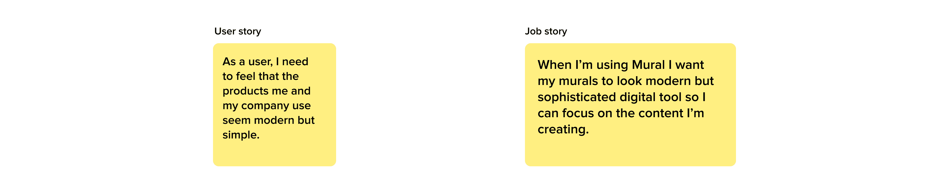
We gathered feedback from individual users and enterprise clients who complained about the look & feel of the product. The churn percentage had risen, and X% of it was related to Mural’s outdated UI. Additionally, X% of the NPS detractors were referring to the UI as “outdated,” “not modern,” and “needing an update.


Definition
The problem statement was defined this way:
So, at the end of 2021, leadership decided to hire an external agency to bring some divergency on UI and provocations so the Mural’s Product Design team could focus on usability improvements.
Ideation
The Branding team, the Product Teams, and the engineers worked with that agency for almost half a year, holding meetings, receiving mockups, and providing feedback. After six months of intense collaborative work, Mural took the lead, and the implementation started
Prototyping and testing
At this point, we learned a great lesson: since the engineering teams were not involved in the project from the very beginning, a lot of issues appeared when they started coding the first interactive prototypes. So, we started a cycle of several iterations over existing proposals and split the work into:
UI System
The design of the complete UI system, including all the components from panels, sidebars, toolbars, etc.
Content UI
All changes in properties from widgets in the canvas: sticky notes, shapes, connectors, text, tables, frameworks, areas, etc.

UI System
This part was pretty straightforward because we were transforming the old UI into new UI. We also combined it with some Information Architecture improvements we already had in our radar.
Among all the UI changes done, we can list:
- Changes in font sizes and contrast, aiming to improve accessibility
- Increased sizes in general
- Changes in all the icons’ system
- Softening of all corners


Content UI
This was the most complex and interesting part because there were so many aspects and tensions we needed to balance:
We wanted changes in the UI not to be purely aesthetic but also to improve legibility and accessibility. So, even though we aimed to enhance the visual aspect by adding rounded corners and shadows, we also wanted to increase padding, line height, font sizes, and the sizes of default elements in general. And that posed a problem.
Why? Two words: backwards compatibility
We needed to apply all UI changes to the widgets created after the Hana release, while considering how these changes would impact existing widgets and previously created murals (classic murals). Additionally, we had to consider how the whole experience would feel for somebody who has been using Mural for years and who has many murals they use daily.
Radically changing the UI of a 10-year-old product is no joke, as users are often resistant to changes. We have users who run workshops across big companies, and they already have dozens of murals created that they duplicate and reuse constantly. Therefore, we had to allow them to try the new UI while also providing the option to revert to the previous one if needed. Simultaneously, we had to encourage them to gradually transition to the new look and feel without compromising their old work.
Changing the padding and line height in existing stickies, shapes, and text would disrupt the layouts of old murals. In other words, if we applied the new values for padding and line height in old murals, users would have to manually adjust all their old murals, which was unacceptable.
This problem required cross-discipline collaboration. Therefore, we conducted a Design Sprint involving PMs, Developers, and designers to come up with a solution.
Provocations
The solution had to consider several aspects:
- Encourage users to start using the new UI.
- Allow users to feel safe by providing the option to revert to the previous UI when needed.
- Preserve users' work, ensuring that old murals' layout doesn't change.
- Maintain performance levels without compromising speed or responsiveness. This excluded the possibility of re-measuring all widgets in old murals to convert them into new values without altering the general layout.
- Ensure consistency between old and new murals. If a user copies and pastes elements from old murals to new murals, all murals should have the same style.
The solution
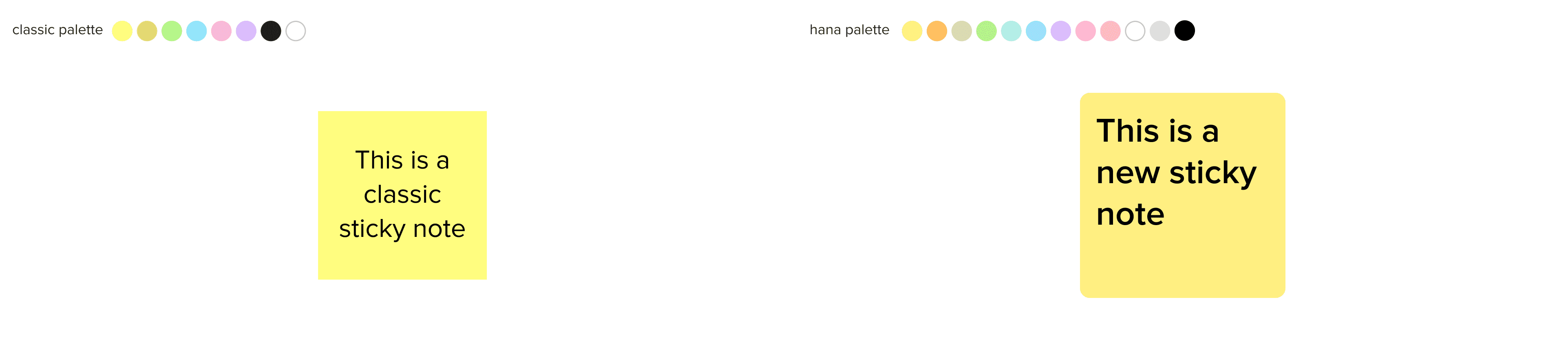
The solution consisted of not only two themes for the UI content (old UI, called Classic, and new UI, called Hana) but also adding two more themes. One of these themes, called Hana Lite, included all visual changes but excluded the changes in sizes that would modify users' old layout. The other theme, called Classic Lite, included the changes in sizes but not the visual modifications.
When a user creates a new Mural after the Hana release, they will create a 100% Hana mural with new padding, line height, and sizes. In case they don't like the new UI, they can convert the mural's content to Classic, but that mural will never be 100% Classic. It won't display the rounded corners, shadows, or the new color palette, but the new padding and line height will remain.
When a user goes to a Classic old Mural and converts it to Hana, it will actually turn into a Hana Lite mural, where the changes in sizes, padding, and line height won't apply, so that the general layout doesn't break. However, the user will see the new colors, rounded corners, and shadows.

How does it apply to the widgets?
Classic sticky note vs. Hana sticky note
Anatomy

When selected

Properties’ changes across the themes

Validation of best padding values in stickies

Results
This way, we could provide users with a way to go back and forth and try the new UI with less risk. It's important to point out that we worked with the assumption that the average user wouldn't perceive the changes in sizes, padding, and line height. So far, XX users have used the new UI, and we have had zero complaints.
Learnings
Engineering must be included in the design process from the very beginning, no excuses. Collaboration is essential when dealing with a wicked problem.


